
Each year, players in the paint industry forecast annual color trends. After 2017's pretty, but safe, Greenery (15-0343), Pantone, the color-matching standard for the design industry, chose a stunning Ultra Violet (color 18-3838) for its 2018 pick.
Benjamin Moore's 2018 color is a hot, spicy red, appropriately called Caliente and described as a "lush carpet rolled out for a grand arrival."
Sherwin-Williams' 2018 pick is called Oceanside. It's a "green meets blue tone....that offers a sense of the familiar with a hint of the unknown." For 2018, Sherwin Williams also features a suite of new palettes: Sincerity ("sand, complex grays and hazy botanicals"), Unity ("memorable pops of peacock color") and Connectivity ("high-tech palette... pixelated in orange, violets, digital greens and high-def yellow").
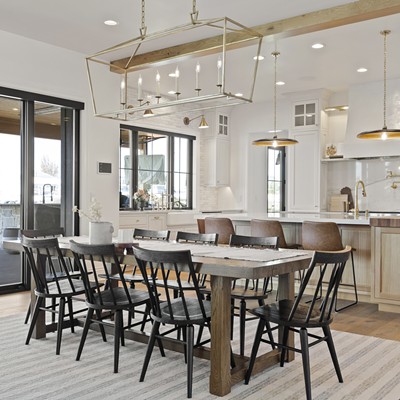
"Most trends include a neutral background and bold colors that are layered in as accents in the room," says Heidi La Bolle of Sherwin-Williams. But what's neutral is changing: "We've seen a large shift from beiges to grays," she adds.
But all grays are not created equal, and when it comes time to choose a paint, things can get complicated. That's partly due to our somewhat unstable perception of colors: While the pigments in a paint obviously don't change, how we perceive them can vary considerably, depending on surrounding colors and the light source in a room.
"North-facing windows let in light that is predominately green and blue," which will intensify those colors in a room, says Spokane interior designer and owner of Nook Interiors, Bridgit Wilson. "South-facing windows let in warm light all day long, so any color looks good in them."
Wilson recommends thoroughly testing your paint choice before committing to a whole wallful. She suggests ordering large-format paint samples, or painting very large pieces of white paper with your prospective color. Place them on any wall you expect to paint. An alternative is applying three coats of paint to test spots on the walls. Observe the color for a while to make sure you like it under various conditions — daylight, incandescent light, on sunny days and on cloudy days.
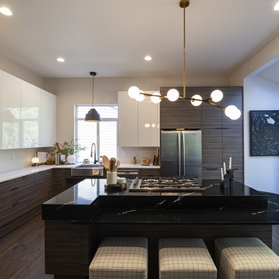
Avoid the common mistake of a boring palette created by matching the wall color to everything else — trim, furniture and flooring — in a room. Instead, consider drumming up at least a little drama. "Try contrasting the warm tones in a home with a white, gray or a darker bold color," says Labolle.
Pops of color that are easy to add, says Labolle, "include a bold front door, painted furniture or kitchen cabinetry, colorful powder rooms." If you're feeling bold, consider, "dark and cozy master suites."
Wilson concurs. "What I'm seeing now is the use of grey as a ground color, and then combining bold colors with it to add interest," she says. Gray, which can be warmer or cooler depending on the particular paint color you choose, goes with everything. "The sky's the limit as far as adding that pop of color with your grays."
Quick Rolling
"Trim is very tedious, and that's probably the worst part of painting," says Brent Kaufman of Coeur d'Alene-based TK's Painting. His team likes to maximize their more satisfying wall-painting time by using an 18-inch wide roller — they like Purdy and Wooster brands. These big rollers — twice the width of a standard roller — are equally effective spreading fresh paint or back-rolling after a sprayer.