
Daniel Walters photo
You merely adopted the horrible air quality — Joe Camel was born in it, molded by it.
Remember the days when your mom would try to trick you into becoming healthy by forcing you to go outside and play? Not now. These days, with wildfire smoke dominating both our skies and our lungs, the Spokane Regional Clean Air Agency pretty much has the opposite message. It makes you want to stay inside, seal your windows, lock your doors and, if possible, only consume oxygen intravenously.
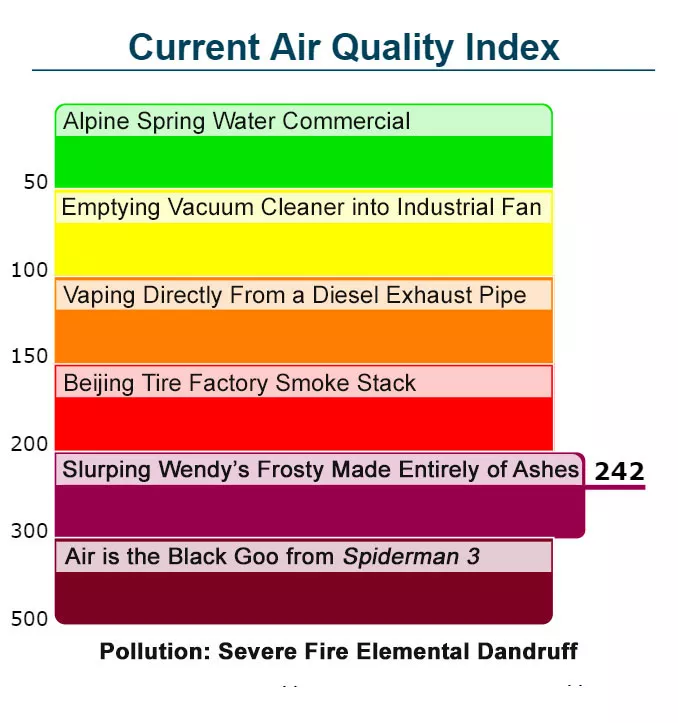
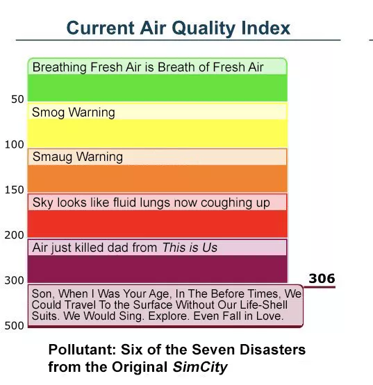
The Spokane Regional Clean Air Agency has a handy-dandy Air Quality Index chart to give you an idea for how disgusting the air tastes at any one time.
Unfortunately, from a writer's perspective, the actual labels on the chart ("Good, Moderate, Unhealthy for Some Groups, Unhealthy, Very Unhealthy, Hazardous") are a bit dull. I mean, come on, they have "unhealthy" three different times.
Fortunately, we are nothing if not helpful.
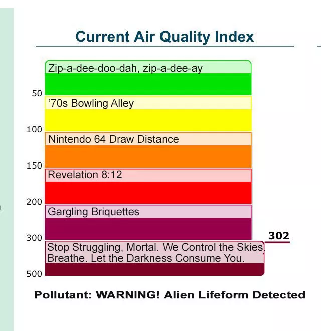
Daniel Walters photo illustration

Daniel Walters photo illustration
Daniel Walters photo illustration